
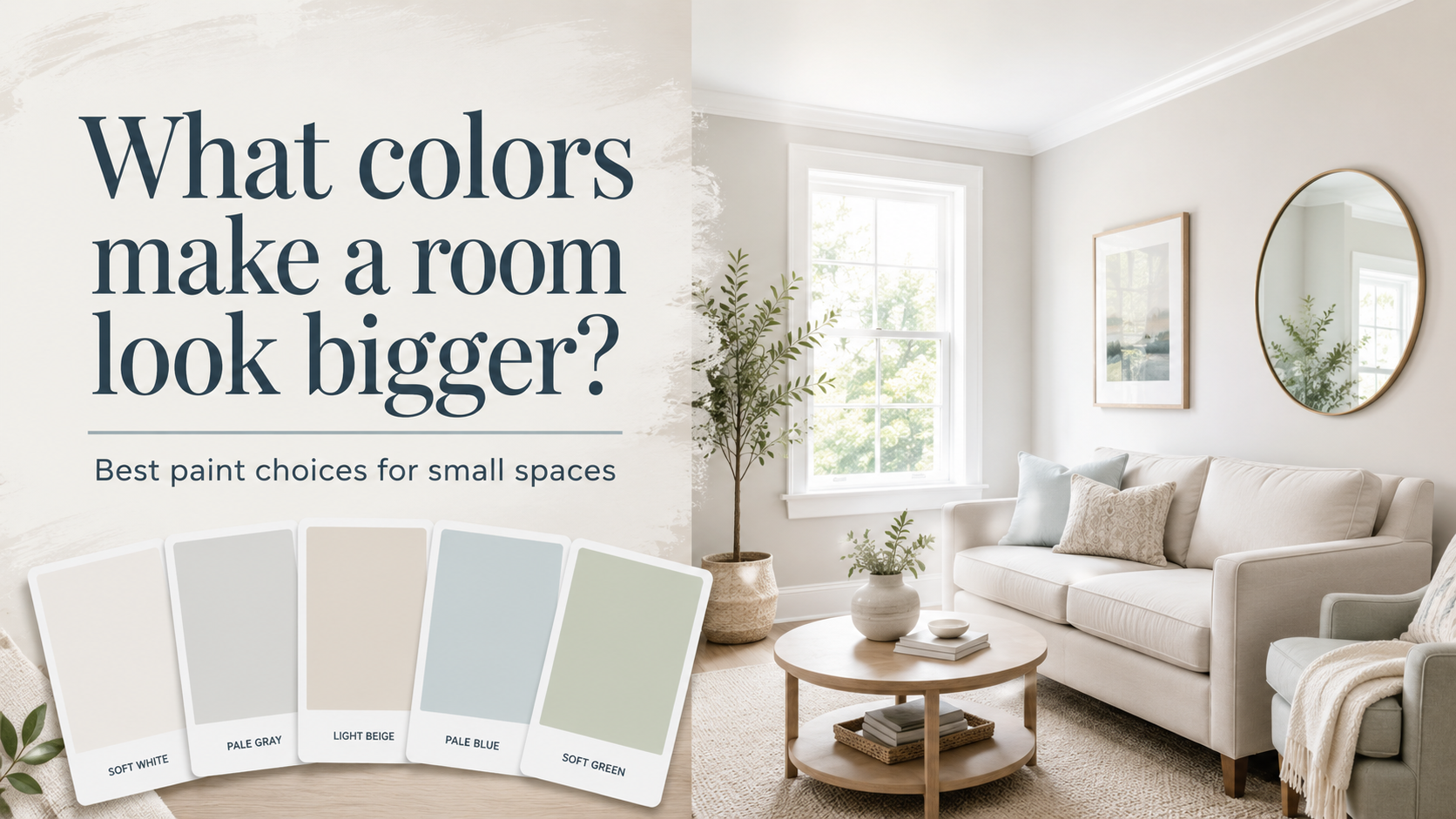
What colors make a room look bigger? In most spaces, soft whites, off-whites, pale neutrals, light blues, gentle greens, and other light-reflective colors create the strongest sense of openness. They reflect more available light and can reduce the visual weight of walls, making a compact room feel brighter and less enclosed.
But white is not the only answer. The amount of natural light, paint undertone, ceiling color, trim, and even sheen can change how spacious a room feels. Sherwin-Williams specifically recommends soft whites, pale grays, and gentle beiges with higher Light Reflectance Values for rooms where the goal is a more expansive appearance.
Here is how to choose a color that works with your actual room rather than simply picking the lightest paint chip available.
1. Soft White Creates an Open, Continuous Look
White remains one of the most reliable choices for visually opening a room because it reflects a large amount of available light.
However, stark white is not always necessary.
Soft whites can create the same airy appearance without feeling overly cold or clinical. Benjamin Moore recommends off-whites and other light colors when the goal is to make smaller rooms appear larger and brighter.
The right white depends heavily on the lighting:
- Warm white can complement warm flooring and wood furniture.
- Cooler white can work well in contemporary spaces.
- Off-white can soften a room with limited natural light.
Avoid choosing white from a tiny sample alone. Its undertone becomes much more noticeable once it covers four walls.
2. Pale Gray Can Make a Small Room Feel More Expansive
Light gray provides slightly more definition than white while still maintaining a bright, open appearance.
Sherwin-Williams includes pale gray among the lighter, higher-LRV color families that can help a room feel more spacious.
The key is keeping the gray light enough for the room’s available light.
A cool gray may work beautifully in a bright south-facing room, while a warmer gray can prevent a darker room from feeling cold.
3. Light Beige and Greige Add Warmth Without Closing the Room In
Homeowners who find white too stark can move toward beige, cream, taupe, or greige.
These colors maintain many of the space-enhancing benefits of light paint while adding warmth.
Sherwin-Williams recommends gentle beige alongside soft whites and pale grays when homeowners want a more expansive feeling.
Greige can be especially useful in open-concept homes because it works comfortably with many wood tones, flooring materials, furniture colors, and adjoining rooms.
4. Pale Blue Can Make Walls Feel Farther Away
Cool colors can visually recede, which can help create a sense of depth.
Sherwin-Williams specifically identifies blue, green, and violet as colors that can make walls appear to recede in smaller spaces.
Pale blue works particularly well in:
- Bedrooms
- Bathrooms
- Small offices
- Guest rooms
- Rooms with plenty of natural light
The effect is usually strongest when the blue is light and muted rather than heavily saturated.
5. Soft Green Can Feel Open Without Looking Neutral
If you want more color than beige or gray, light green can be an excellent alternative.
Sherwin-Williams recommends lighter greens with higher Light Reflectance Values when the goal is to make a space appear larger, particularly where good natural light is available.
Soft sage, pale eucalyptus, muted mint, and gray-green tones can add personality without creating the visual heaviness associated with deeper colors.
They also pair naturally with white, cream, wood, and many neutral furnishings.
6. Pale Yellow Can Brighten a Dim Small Room
Soft yellow can introduce warmth while maintaining a light appearance.
Benjamin Moore identifies subtle yellow hues among light-enhancing colors that can help open smaller spaces.
The important word is soft.
A highly saturated yellow can dominate a small room. A pale buttery or creamy yellow generally provides a gentler effect, especially where natural daylight is limited.
7. A Tonal Color Scheme Can Make Boundaries Less Obvious
Making a room look larger is not only about choosing a light color. Reducing strong visual boundaries can also help.
Painting walls, trim, doors, and architectural details in the same color or closely related tones creates continuity. Sherwin-Williams notes that using the same wall and trim color can make a room appear larger, while a lighter ceiling can make the room feel taller.
For example, instead of combining beige walls with sharply contrasting dark trim, you might use:
- Light greige walls
- Similar light greige trim
- A slightly lighter ceiling
The eye moves through the room with fewer interruptions.
8. Dark Colors Can Work, but Use Them Strategically
One of the biggest misconceptions about what colors make a room look bigger is that dark colors must always be avoided.
Light colors are generally the safest choice when the goal is brightness, but a strategically placed deeper color can create visual depth.
A darker color on the far wall of a long room, for example, can alter how the room’s proportions are perceived. Sherwin-Williams recommends using slightly darker colors on shorter walls and lighter colors on longer walls when trying to visually widen a long, narrow room.
Deep blue, charcoal, or green can therefore work as deliberate design tools rather than automatically making every room feel cramped.
Pay Attention to LRV When Choosing Paint
One useful number to check on a paint specification is LRV, or Light Reflectance Value.
LRV represents how much visible light a painted surface reflects. Benjamin Moore describes it as the percentage of light reflected from a surface.
Higher-LRV colors generally reflect more light.
Sherwin-Williams recommends soft whites, pale grays, and gentle beiges with an LRV above approximately 65 when the goal is an expansive feeling.
LRV should not be treated as the only deciding factor, however. A high-LRV color can still look different depending on windows, room orientation, flooring, furniture, and artificial lighting.
Should the Ceiling Be Lighter Than the Walls?
Often, yes.
A lighter ceiling can visually increase the feeling of height. Sherwin-Williams recommends painting ceilings lighter than walls when homeowners want a room to feel taller and more spacious.
Another option is using a slight variation of the wall color instead of bright white. Benjamin Moore notes that light wall colors paired with a lighter ceiling or a subtle variation of the same color can visually heighten smaller rooms.
This produces a softer transition while maintaining the sense of openness.
Does Paint Sheen Make a Room Look Bigger?
Sheen can contribute to the effect because more reflective finishes bounce additional light around the room.
Sherwin-Williams suggests pearl or satin finishes when homeowners want a soft luminous effect that can help a room feel larger.
However, higher sheen can also make wall imperfections more noticeable. The surface condition and room use should therefore influence the final selection.
Always Test Colors in the Actual Room
The same paint can look dramatically different in two rooms because lighting changes throughout the day.
Sherwin-Williams explains that natural and artificial light can substantially change how a paint color appears and recommends testing larger samples before making a final decision.
Check your sample:
- Early in the morning
- During the brightest part of the day
- In evening light
- With lamps turned on
- Beside flooring and furniture
For homeowners who want help coordinating color, sheen, preparation, and professional application, experienced residential painters charlotte nc can help evaluate how a palette will work with the actual lighting and surfaces in the home.
So, What Colors Make a Room Look Bigger?
If your main goal is to create a brighter, more spacious feeling, begin with soft white, off-white, pale gray, light beige, greige, pale blue, soft green, or gentle yellow.
But do not choose based on color name alone.
Consider the room’s natural light, LRV, undertones, flooring, ceiling, trim, furnishings, and how adjoining spaces connect. A consistent light palette can blur visual boundaries, while carefully placed darker colors can sometimes create additional depth. The best color is ultimately not simply the lightest one. It is the color that works with the room’s existing light and creates the visual continuity needed to make the space feel larger than it actually is.