
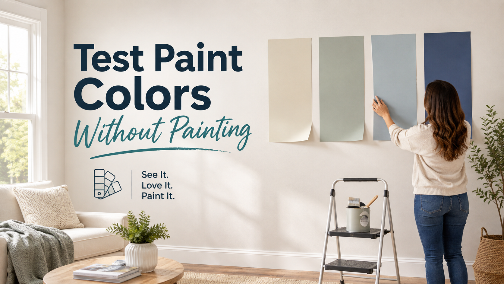
Choosing a paint color can be surprisingly difficult because the shade you love on a small swatch may look completely different once it is surrounded by your flooring, furniture, trim, natural light, and artificial lighting. The good news is that you do not need to cover your walls with several test patches just to make a confident decision.
If you are wondering How to test paint colors without painting the wall, the most practical approach is to use large peel-and-stick samples, movable painted boards, and digital visualization tools, then evaluate those samples at different times of day and beside the permanent features in the room. This gives you a much more realistic idea of how a color will behave without creating extra sanding, priming, or touch-up work later.
Why Tiny Paint Swatches Often Lead to Bad Decisions
Small paint chips are useful for narrowing down a general color family, but they are not large enough to show how a shade will actually feel across an entire room. A two-inch sample may look pleasantly warm in your hand, yet appear too yellow once it is placed beside a cool gray floor or under warm evening lighting.
Color is influenced by its surroundings, which means you should always consider more than the paint itself. The appearance of a wall color can change depending on:
- The direction and amount of natural light
- The color of flooring and rugs
- Cabinetry and countertops
- Existing trim and ceiling colors
- Large furniture pieces
- Nearby rooms that remain visible
- The type of bulbs used after sunset
Instead of asking whether you like a color on its own, ask whether you like that color in your actual room.
Use Large Peel-and-Stick Samples for a More Realistic Preview
Large removable paint samples are one of the easiest ways to compare colors without applying anything directly to the wall. Because they cover more surface area than a traditional paint chip, they allow you to see the undertones and overall depth of the shade more clearly.
The biggest advantage is that they can be moved. Rather than leaving a sample in one location and making a decision from there, place it on several different walls throughout the room. A color near a sunny window may appear significantly warmer or lighter than the same color on a shaded interior wall.
Move Samples to the Areas That Matter Most
Try viewing your sample beside the features that will remain after painting, such as your sofa, kitchen cabinets, fireplace, flooring, or built-in shelving. You should also move it to the darkest wall in the room and then to the brightest so you can see how much the color changes with lighting.
If you are choosing a shade for an open-plan area, take the sample into adjoining spaces as well. This helps you judge whether the color flows naturally with the rest of the home rather than looking attractive in isolation.
Make Your Own Movable Paint Sample Board
If the exact color you want is not available as a peel-and-stick sample, you can create a movable sample using poster board, foam board, or a purpose-made paintable sheet.
Apply the sample paint to the board using enough coats to represent the finished color properly, then allow it to dry fully before evaluating it. This method gives you the benefit of testing the actual paint while keeping your walls untouched.
Leave a Border Around the Painted Area
It is often helpful to leave a narrow white border around the edge of the board instead of painting all the way to the edges. That border creates a visual separation between the sample and the existing wall color, making it easier to judge the new shade on its own.
This is particularly useful when comparing whites, creams, taupes, greiges, and soft grays, where subtle undertones can easily be distorted by the color surrounding them.
Compare Similar Colors Before Testing Them Individually
When several colors look almost identical, compare them next to one another first. Placing two warm whites or three similar grays side by side can reveal undertones that may not have been obvious when each sample was viewed separately.
For example, one white may suddenly appear slightly yellow, while another may lean gray or blue. Once those differences become easier to recognize, separate the samples and evaluate each color individually in the room.
This two-stage process is much more useful than filling one wall with a dozen competing samples because too many colors placed together can influence how your eyes perceive each one.
Test Colors Throughout the Entire Day
Lighting is one of the main reasons paint colors look different in a home than they did in a store or online. A shade that appears soft and balanced at noon may seem dramatically warmer, cooler, darker, or duller in the evening.
For that reason, avoid making a decision after looking at a sample for only a few minutes.
Morning Light
Morning light can make some colors appear brighter and cleaner, particularly in rooms that receive strong early sunlight.
Afternoon Light
Afternoon conditions often reveal undertones that were less noticeable earlier in the day, especially in rooms that receive warm western light.
Evening and Artificial Lighting
After sunset, lamps and ceiling fixtures become the dominant light source. Warm bulbs may emphasize beige, cream, yellow, and red undertones, while cooler bulbs can make grays and blues appear more prominent.
Leave your strongest samples in place for at least a full day, and preferably longer, so you can see how they behave under the lighting conditions you actually live with.
Do Not Judge Sample Paint While It Is Still Wet
If you are making your own sample boards, give the paint enough time to dry before deciding whether you like it. Wet paint can appear noticeably darker or more saturated than the finished result, and the sheen may also look different while the coating is still curing.
Rather than making an immediate decision, allow the sample to dry completely and then evaluate it in the same lighting conditions you will use to judge your other options. This prevents you from eliminating a good color simply because you assessed it too early.
Look at the Color Beside Permanent Features
One of the most useful ways to narrow down your choices is to compare paint colors directly with materials that are unlikely to change.
Flooring, countertops, stonework, cabinetry, fireplaces, and large furniture pieces often have undertones of their own. A wall color does not need to match these features exactly, but it should feel compatible with them.
Before choosing a final shade, place your sample beside:
- Hardwood or tile flooring
- Kitchen or bathroom cabinetry
- Countertops and backsplashes
- Brick or stone fireplaces
- Large upholstered furniture
- Curtains and window treatments
This is especially important when selecting neutrals because even subtle undertone conflicts can become much more noticeable once an entire room is painted.
Use Digital Visualizers to Narrow the Field
Online paint visualizers can be helpful during the early stages of the decision process because they allow you to experiment with different color families before ordering physical samples.
Some tools let you upload a photograph of your room and digitally change the wall color, which can help answer broader design questions such as whether you prefer a warm or cool palette, whether a darker color feels too heavy, or whether a green, blue, beige, or gray direction works best.
Digital tools should be treated as a filtering step rather than the final test, however. Screen brightness, camera exposure, and monitor settings can all alter the way a paint color appears, so your final decision should still be based on a physical sample viewed in the actual room.
Narrow the Choices Before You Start Sampling
Testing too many colors at once usually creates more confusion instead of more confidence. A better approach is to narrow the possibilities before ordering samples.
Start by thinking about the room’s natural light, existing materials, furniture, and the mood you want to create. Once you have identified a general color family, choose three to five realistic options rather than ten or fifteen.
From there, compare the strongest candidates under different lighting conditions and gradually eliminate the ones that feel too warm, too cool, too dark, or incompatible with the room.
Think About How the Color Connects With the Rest of the Home
A color can look excellent inside one room and still feel wrong when viewed from the hallway or adjoining space. This is particularly important in open-plan homes where several rooms can be seen at once.
Step outside the room and look back at the sample from different viewpoints. Consider whether the undertones work with nearby walls and whether the transition feels intentional rather than abrupt.
You do not need to use the same paint color throughout the house, but the overall palette should feel connected.
When Professional Color Guidance Makes Sense
Color selection becomes more complicated when several rooms, fixed finishes, or architectural details need to be coordinated at the same time. Professional painters can help homeowners think beyond the color chip by considering lighting, sheen, trim, preparation, and how the selected shade will work once it covers a much larger surface.
If you are planning a larger repaint, experienced residential painters charlotte nc homeowners hire can also help evaluate the practical side of the project, including surface preparation, finish selection, and how different rooms should be scheduled and coordinated.
Choose the Color Only After You Have Seen It in Real Conditions
Learning How to test paint colors without painting the wall is really about creating a more realistic testing process before making a permanent decision. Large movable samples, properly painted sample boards, digital tools, and careful observation throughout the day can all help you understand how a color will behave in your specific space.
The best paint color is not necessarily the one that looks most attractive on a screen or in a showroom. It is the one that works with your home’s lighting, flooring, furniture, trim, and adjoining rooms from morning through evening. Taking an extra day or two to test your strongest options can help you choose with far more confidence while avoiding unnecessary sample patches, repainting, and second-guessing once the full project begins.