
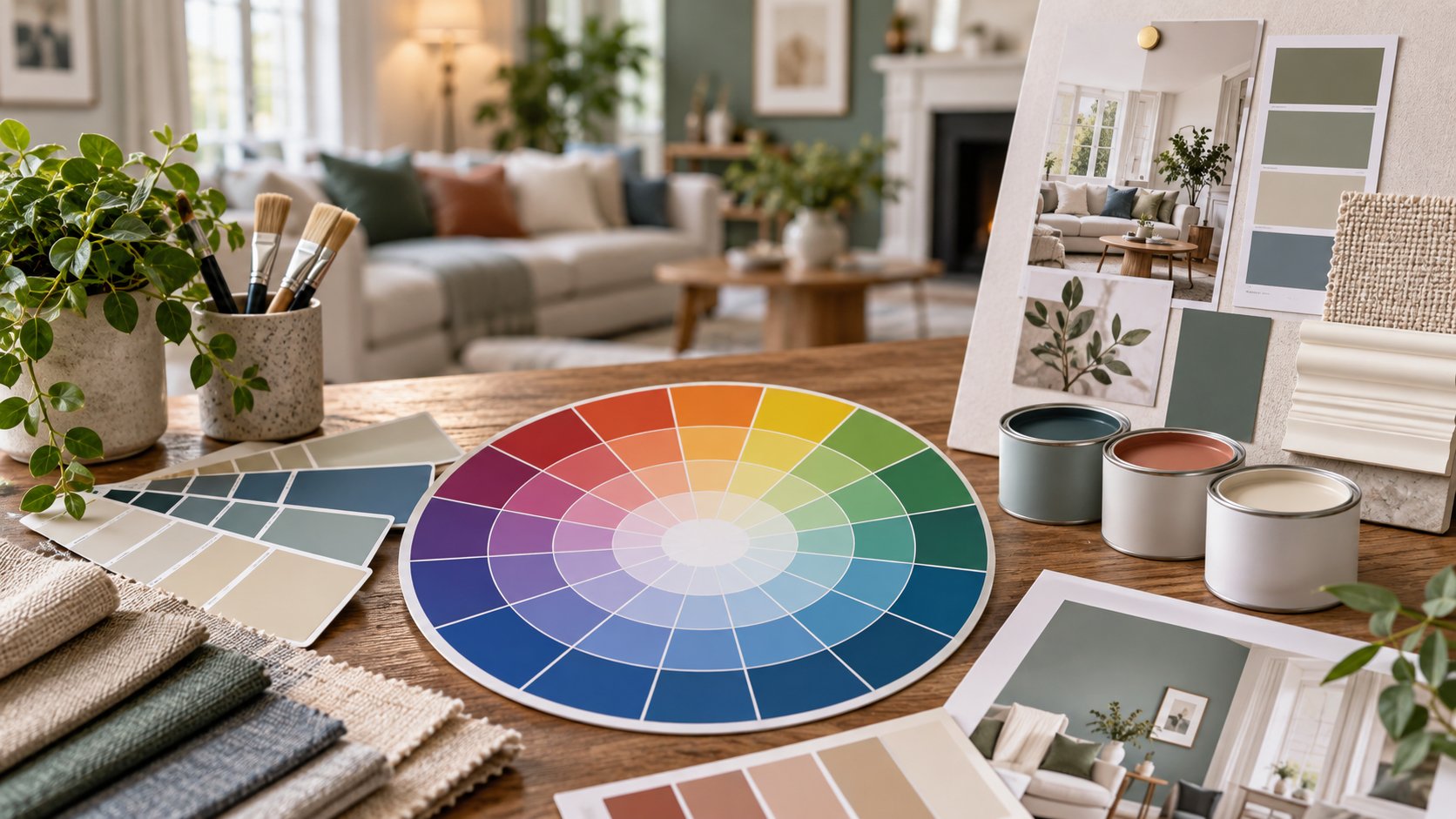
Learning how to use a color wheel can make choosing interior paint considerably easier, but the most useful starting point is not memorizing primary, secondary, and tertiary colors. For homeowners, the real value of the color wheel is understanding which colors will support, soften, or contrast with something already in the room.
That “something” could be a sofa, hardwood floor, kitchen countertop, rug, fireplace stone, cabinet finish, or even a favorite piece of artwork.
Once you have an anchor, the color wheel becomes a practical decision-making tool instead of a circle filled with colors.
Step 1: Find the Color Your Room Cannot Ignore
Before looking at paint samples, identify the dominant permanent or expensive-to-replace element in the room.
Imagine a living room with:
- Warm oak flooring
- A navy sofa
- Cream curtains
- Brass lighting
- A patterned rug containing blue and rust
The paint should work with these elements rather than forcing everything else to work around the walls.
Turn Your Anchor Into a Color Family
You do not need to find an exact match on the color wheel.
Instead, identify its general hue.
A navy sofa belongs to the blue family. Terracotta tile leans toward orange. Sage cabinetry belongs to green. Burgundy upholstery sits within the red-violet area.
Sherwin-Williams describes hue as the general color family and organizes the traditional wheel into 12 main color families.
Once you know your anchor hue, you can decide what type of relationship you want the wall color to have with it.
Step 2: Decide How Much Contrast the Room Needs
This is where understanding how to use a color wheel becomes especially useful.
You essentially have four practical directions.
Want a Calm Room? Stay Close on the Wheel
Colors located beside one another are known as analogous colors.
For example:
Blue → Blue-Green → Green
or
Yellow → Yellow-Orange → Orange
Benjamin Moore describes an analogous scheme as combining color families located next to one another on the wheel. Because the hues share visual relationships, they tend to create a cohesive palette.
This approach can work beautifully in bedrooms, bathrooms, living spaces, and other rooms where you want visual flow rather than strong contrast.
Suppose your sofa is blue. Instead of painting the room another blue, you might explore muted blue-green or green-gray walls.
The room remains coordinated without appearing overly matched.
Want Drama? Look Across the Wheel
Colors directly opposite one another are complementary colors.
Classic examples include:
- Blue and orange
- Red and green
- Yellow and violet
Sherwin-Williams notes that complementary colors create stronger contrast and can make each hue appear more vibrant.
That does not mean painting one wall electric blue and another bright orange.
Interior design usually works better when one color dominates while its complement appears more selectively.
For example:
Warm blue walls + muted rust pillows
or
Soft green walls + burgundy artwork
The color relationship remains complementary, but lowering the saturation makes it more comfortable for everyday living.
Step 3: Use One Hue When You Want Simplicity
The color wheel is not only useful for finding contrasting colors.
Sometimes the best solution is staying within one color family.
A monochromatic palette uses lighter, darker, softer, or stronger variations of the same basic hue. Sherwin-Williams notes that varying the value and saturation of one hue can create a sophisticated, cohesive effect.
Imagine choosing green as your base.
You might use:
- Pale green-gray walls
- Medium sage upholstery
- Dark forest-green accessories
- Cream trim
- Natural wood for warmth
The room contains plenty of variation without introducing several competing hues.
This Works Especially Well in Open Spaces
Monochromatic palettes can also help rooms visually connect.
If a kitchen opens directly into a dining and living area, different values from one color family can create separation without making each space look unrelated.
That is often more effective than choosing three completely independent paint colors.
Step 4: Use the Wheel for Accents, Not Just Walls
One of the biggest mistakes people make when learning how to use a color wheel is assuming every color in the chosen scheme has to become wall paint.
It does not.
Your complete palette includes:
Wall paint + trim + furniture + flooring + textiles + artwork + metal finishes + accessories
Suppose you love a complementary blue-and-orange scheme.
Your room might actually look like this:
- Soft neutral walls
- Deep blue sofa
- Warm oak flooring
- Terracotta cushions
- Brass lighting
- Cream trim
The color wheel helped establish the relationship, even though neither complementary color became the primary wall color.
Think About Visual Weight
The stronger the color, the less of it you may need.
A highly saturated red-orange accent may need only a few pillows or a piece of artwork to balance a much larger area of muted blue.
This is why complementary palettes can feel sophisticated rather than loud when the colors are used in different proportions.
Step 5: Check Warmth, Value and Saturation Before Buying Paint
Finding the correct hue family does not mean you have found the correct paint.
Three blue paints can have completely different personalities.
One might appear:
- Light and airy
- Deep and dramatic
- Gray and subdued
Color professionals distinguish between hue, value, and saturation because all three affect how a color behaves. Value describes how light or dark a color appears, while saturation relates to its intensity.
Warm and Cool Versions Matter Too
Color families can contain warmer and cooler variations.
Sherwin-Williams broadly groups reds, oranges, and yellows as warmer colors and blues, greens, and violets as cooler families, while also noting that undertones can alter how individual colors feel.
This matters when coordinating paint with fixed materials.
For example, a cool gray wall beside warm beige stone can sometimes feel disconnected even though both appear “neutral.”
The color wheel establishes the broad relationship. Undertones refine it.
Try This Real-Room Exercise Before Choosing Paint
Take a photograph of the room and identify the three strongest existing colors.
For example:
Floor: warm brown
Sofa: blue
Rug: cream with rust details
Now find blue on the color wheel.
Across from blue is orange. Your warm brown floor and rust rug already belong near that side of the wheel.
You have just discovered that the room contains a naturally complementary relationship.
Instead of adding another competing color, you might choose:
- Soft blue-gray walls to strengthen the blue family
- Warm off-white walls to let existing colors lead
- Muted blue-green for a softer analogous extension
Suddenly you are choosing paint based on relationships rather than guessing from hundreds of swatches.
Do Not Let the Color Wheel Make the Final Decision
The color wheel is a planning tool, not a substitute for testing actual paint.
Room lighting can dramatically change how color appears throughout the day. Flooring, furniture, window direction, artificial lighting, and adjacent rooms also influence perception.
Before committing to a paint color:
- Narrow the choice to two or three candidates.
- View large samples on more than one wall.
- Check them in morning and afternoon daylight.
- Look again under evening lighting.
- Compare them directly with flooring, trim, furniture, and permanent finishes.
A color that looks perfect under bright store lighting may behave very differently inside your home.
Use Color Theory to Make Decisions, Not Rules
Once you understand how to use a color wheel, choosing paint becomes less about finding a single “perfect color” and more about building relationships.
Choose an existing anchor. Decide whether the room needs harmony or contrast. Explore analogous, complementary, or monochromatic relationships. Then refine the palette through lightness, saturation, undertones, and real-world sampling. The best interiors do not necessarily follow color theory rigidly. They use it as a framework and then adapt it to the architecture, furnishings, lighting, and personality of the home. If you have narrowed your palette but want help translating those colors into clean, professionally finished walls and trim, experienced Painters in Davidson nc can help complete the transformation with the surface preparation and application quality needed to make your chosen colors look their best.