
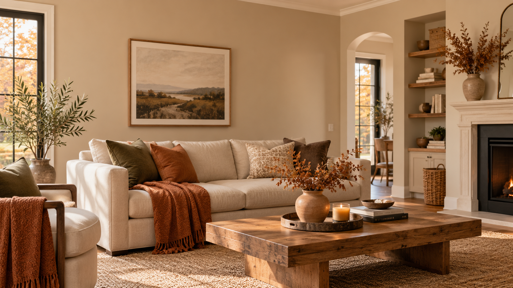
Autumn brings a beautiful transformation in nature. Golden leaves, earthy browns, muted greens, and rich orange tones create a warm, welcoming atmosphere. These seasonal colors often inspire homeowners to refresh their interiors. However, not everyone wants dramatic orange walls or dark brown accents. Sometimes, a softer neutral can capture the same cozy feeling.
Is beige a fall color? Absolutely! Beige is one of the most versatile colors in an autumn-inspired palette. Its warm, earthy undertones complement traditional fall shades such as terracotta, olive green, burnt orange, and chocolate brown. More importantly, beige creates a timeless foundation that looks attractive throughout the year.
For homeowners considering an interior painting project, choosing the right beige can introduce seasonal warmth without requiring frequent color changes. The key is understanding its undertones, lighting requirements, and complementary colors.
Why Beige Belongs in the Fall Color Palette
Fall decorating usually brings to mind bold colors inspired by changing leaves. Yet autumn also includes softer natural shades found in dried grasses, sandstone, tree bark, and harvested fields.
Beige reflects these understated elements of the season.
Unlike bright white, which can sometimes appear stark, warm beige introduces subtle depth to interior walls. It creates a comfortable background for wooden furniture, textured fabrics, and seasonal decorations.
There are several reasons beige works beautifully in autumn interiors:
- Natural warmth: Golden and sandy undertones reflect the earthy character of fall.
- Color flexibility: Beige complements both rich autumn accents and lighter neutral furnishings.
- Timeless appearance: Beige walls remain suitable after seasonal decorations are removed.
- Versatile styling: The color works with traditional, farmhouse, contemporary, and transitional interiors.
- Visual balance: Neutral walls help prevent bold autumn accessories from overwhelming a room.
When homeowners ask, “Is beige a fall color?” the answer depends partly on the shade. Warm beige typically feels more autumn-inspired than cooler beige with pronounced gray undertones.
Understanding Different Shades of Beige for Fall Interiors
Not every beige paint produces the same atmosphere. Some shades lean toward yellow, others toward pink, brown, or gray.
Selecting the right undertone is essential for achieving a balanced interior.
1. Warm Beige for a Cozy Living Room
Warm beige contains subtle golden, cream, or yellow undertones. These shades create an inviting appearance, particularly when combined with wood flooring and soft lighting.
Warm beige works well in living rooms, dining areas, and family spaces where homeowners want a welcoming environment.
2. Sandy Beige for a Light and Airy Appearance
Sandy beige offers a lighter interpretation of autumn colors. It resembles natural sand and pale wheat, making it suitable for homeowners who prefer understated decorating.
This shade pairs beautifully with off-white trim, linen curtains, and natural wood furniture.
3. Taupe Beige for a Sophisticated Fall Look
Taupe sits between beige, brown, and gray. Warmer taupe shades offer an elegant appearance without creating the heavier effect associated with darker brown walls.
Taupe beige works particularly well in bedrooms, home offices, and formal living spaces.
4. Caramel Beige for Rich Autumn Warmth
Caramel beige features deeper golden-brown undertones. It can make larger rooms feel more intimate while complementing copper decorations, leather furniture, and dark wood.
For smaller or poorly lit spaces, consider using caramel beige on an accent wall rather than throughout the entire room.
What Colors Go Best With Beige During Fall?
Beige becomes more visually interesting when paired with complementary colors. Instead of treating it as a plain background, use it to connect different elements of your interior design.
Here are five effective autumn color combinations:
Beige and Terracotta

A warm Mediterranean-inspired combination that suits living rooms and dining spaces.
Beige and Olive Green

An earthy pairing inspired by nature, ideal for bedrooms and relaxed family rooms.
Beige and Chocolate Brown

A classic combination that introduces depth through furniture and wood finishes.
Beige and Burgundy

A refined autumn palette for dining rooms, accent walls, and upholstered furniture.
Beige and Mustard Yellow

A cheerful pairing that adds seasonal warmth without overwhelming neutral interiors.Illustrative color combinations; actual paint appearance varies with finish and lighting.
For a cohesive appearance, choose one dominant neutral and introduce richer autumn colors through smaller decorative elements.
How to Choose Beige Paint Based on Your Room’s Lighting
A beige shade that looks perfect on a paint sample may appear completely different once applied to your walls.
Natural light, room orientation, flooring, and artificial lighting all influence how a color appears.
North-Facing Rooms
North-facing rooms often receive cooler, indirect light. Beige paint with golden or creamy undertones can help balance this effect.
Lighter shades with higher light reflectance values may also help the room appear brighter.
South-Facing Rooms
South-facing rooms generally receive more direct, warm sunlight. Beige shades can appear noticeably yellower under these conditions.
A balanced beige or muted taupe may provide a more comfortable appearance.
East- and West-Facing Rooms
Light changes significantly throughout the day in east- and west-facing spaces.
Test beige samples in morning, afternoon, and evening conditions before committing to a color.
Sherwin-Williams emphasizes that room orientation and light reflectance value play important roles in selecting neutral paint colors.
Best Places to Use Beige Paint in Your Home This Fall
Beige is flexible enough to work throughout the house, but the appropriate shade depends on how each room is used.
Living Rooms: Choose warm beige walls with olive green cushions, wooden furniture, and terracotta accessories. This creates an inviting environment without excessive decoration.
Bedrooms: Soft sandy beige or muted taupe can establish a relaxing atmosphere. Add cream bedding, natural textiles, and darker accent pillows for contrast.
Kitchens: Beige walls complement white cabinets, natural stone countertops, and wooden shelving. Deeper beige can also work on cabinetry when balanced with lighter surfaces.
Dining Rooms: Caramel beige paired with dark furniture, warm metal fixtures, and soft lighting creates an elegant setting for autumn gatherings.
Entryways: A medium beige can make an entryway feel welcoming while providing a neutral background for artwork and seasonal decorations.
How to Make Beige Walls Look Modern Instead of Outdated
Some homeowners associate beige with older decorating styles. However, beige itself is not outdated. The surrounding materials, contrast, and overall color scheme determine whether a room feels contemporary.
To give beige walls a modern appearance:
- Use crisp cream or soft white trim for subtle contrast.
- Combine beige with black metal fixtures or contemporary lighting.
- Introduce natural materials such as oak, stone, linen, and woven textures.
- Avoid matching every piece of furniture to the wall color.
- Include darker accent shades to create visual depth.
- Choose a consistent paint finish suited to the room’s activity level.
The objective is to create variation rather than decorating every surface in an identical neutral shade.
Should You Paint Your Entire Home Beige for Fall?
Painting every room beige can create a cohesive interior, especially in homes with open floor plans. However, using the exact same shade everywhere is not always necessary.
Lighting conditions vary between rooms, which can make one beige shade appear golden in one space and gray in another.
For better results, establish a coordinated color palette with two or three compatible neutral shades.
Before painting an entire room, apply samples to multiple walls and observe them under different lighting conditions. Large samples can help reveal undertones that are difficult to identify from small paint chips.
Professional painters can also help homeowners select appropriate finishes, prepare surfaces, and achieve consistent coverage.
Frequently Asked Questions About Beige and Fall Colors
Is beige a fall color or a summer color?
Beige works in both seasons. During summer, it often complements coastal whites and light blue accents. In fall, warm beige pairs naturally with terracotta, rust, olive green, and dark brown.
What shade of beige is best for autumn?
Warm beige with golden, sandy, or caramel undertones is especially suitable for autumn-inspired interiors. The best choice also depends on natural lighting and existing furnishings.
Does beige make a room look warmer?
Beige with warm undertones can make a room feel visually cozier. However, paint color does not physically increase the temperature of a space.
Can beige work with gray furniture?
Yes. Balanced beige and taupe shades often complement gray upholstery. Adding wood accents and cream textiles helps connect warm and cool elements.
Is beige a good year-round interior paint color?
Absolutely. Beige is a versatile neutral that adapts to seasonal decorating changes. It provides a practical foundation for homeowners who prefer not to repaint frequently.
Bring Timeless Autumn Warmth Into Your Home With Beige
So, is beige a fall color? Yes, and its greatest advantage is that it offers autumn-inspired warmth without limiting your decorating choices. From creamy sand tones to rich caramel beige, the right shade can complement natural textures, seasonal accessories, and comfortable living spaces throughout the year.
For homeowners planning an interior refresh in Davidson and nearby Charlotte communities, professional painting services can make choosing and applying the right color easier. Century Painting & More provides residential painting solutions for homeowners who value careful preparation and lasting finishes. If you’re searching for experienced Painters in Davidson nc, explore their services to help bring your preferred color palette to life.